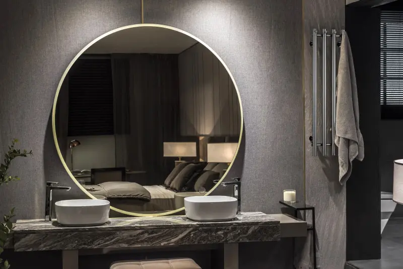
Casa en Blanco is the architecture and design showcase that Edificor hosts in its Córdoba showroom, created to present the latest trends in materials and finishes. Its third edition, under the concept “Diseño de especialidad”, was designed by Lucía Roland (Capó Estudio) and Luciano Baroli (Despacho 56), and inspired by Italy’s Tuscany. It is a good case for reviewing what it really takes to design and execute a neutral-palette project.
Why a neutral palette is more demanding than a colorful one
In a project with a reduced palette, color stops working as a resource: what defines the space is light. White acts as a backdrop, amplifying the perception of scale, depth and texture, but that clarity exposes everything underneath. Every junction, every edge and every transition comes to the foreground.
Working with less color does not make a project simpler. It makes it more demanding on four specific fronts: continuity between surfaces, precision at junctions, coordination of materiality and the effect of natural light. We review each of them.

Continuity between surfaces
Maintaining continuity between planes (floors that extend into walls, surfaces that flow without interruption, circulation paths that are not fragmented) is one of the main challenges of this type of architecture. To achieve it, you need systems that resolve changes of material without creating visual breaks.
Continuity is not the absence of cuts, it is control over how they happen. The most common mistake here is to interrupt that continuity with improvised solutions on site, resolved without a technical criterion defined beforehand.
Coordination of materiality
White is not uniform: it changes with the light, the texture and the material. Coverings, paints, continuous surfaces and modular pieces coexist within a single palette, but they require precise coordination to avoid unwanted contrasts.
A common mistake is mixing different whites without that control of materiality, something that would go unnoticed in a palette with more color but is immediately visible in a monochrome project.
Precision at junctions and edges
In this type of project, finishing systems play a key role: sustaining the clarity of the design without interfering with the overall read. Baseboards, profiles and technical solutions resolve the junctions between planes without creating unnecessary shadows, protect exposed edges while keeping lines clean, and support material continuity by blending into the language of the project without standing out.
These are decisions that do not seek the spotlight but hold the coherence of the space together. That is why it is advisable not to underestimate the importance of these junctions or to resolve them on site without having defined them beforehand.
Effect of natural light
Natural light completely changes how the same white surface is perceived throughout the day. It is important to consider this factor when choosing finishes (matte, satin, textured). A material that works in a render or in a sample under controlled artificial light can behave very differently under direct sunlight.
In a neutral palette, no mistake stays hidden. It gets amplified.


ATRIM baseboards for neutral-palette projects
When the project requires every junction to be precisely defined, choosing the finishing system from the design stage can make the difference. ATRIM offers a range of baseboard solutions to support neutral-palette projects, from minimalist options to ones that incorporate lighting:
Minimalism: Slim Baseboard, Matte Chrome, 100 mm x 10 mm x 2.50 m
Classic finish: Classic Baseboard, Silver, 70 mm x 15 mm x 2.5 m
Integration: Pecho Paloma Baseboard, Matte White, 100 mm x 15 mm x 2.5 m
Lighting: LED Baseboard, Matte Chrome, 60 mm x 13 mm x 2.5 m
Materiality: Extra Line Baseboard, Cement, 100 mm x 15 mm x 2.5 m
Explore all ATRIM baseboards and find the solution that best fits your project.